

Components
Accordion
Alert Dialog
Aspect Ratio
Avatar
Badge
Bottomsheet
Breadcrumb
Button
Calendar View
Callout
Card
Carousel
Checkbox
Checkbox Group
Checkbox Cards
Combobox
Context Menu
Data List
Dialog
DataGrid
Datepicker
Dropdown Menu
File Upload
Hover Card
Icon Button
Input
Input Card Number
Input Mask
Input Number
InputOTP
Input Phone Number
Input RRN
Inset
Pagination
Popover
Progress
Radio
Radio Group
Radio Cards
Rating
Resizable
Scroll Area
Segmented Control
Select
Separator
Skeleton
Slider
Spinner
Switch
Table
Tabs
Tab Nav
Toast
Text Area
Text Field
Tooltip
TreeView
Components
Card
관련된 콘텐츠와 동작을 그룹화하는 컨테이너입니다.
Teodros Girmay
Engineering
<Box maxWidth="240px">
	<Card>
		<Flex gap="3" align="center">
			<Avatar
				size="3"
				src="https://images.unsplash.com/photo-1607346256330-dee7af15f7c5?&w=64&h=64&dpr=2&q=70&crop=focalpoint&fp-x=0.67&fp-y=0.5&fp-z=1.4&fit=crop"
				radius="full"
				fallback="T"
			/>
			<Box>
				<Text as="div" size="2" weight="bold">
					Teodros Girmay
				</Text>
				<Text as="div" size="2" color="gray">
					Engineering
				</Text>
			</Box>
		</Flex>
	</Card>
</Box>
API Reference
이 컴포넌트는 div 요소를 기반으로 하며 common margin props를 지원합니다.
| Prop | Type | Default |
|---|---|---|
asChild | boolean | No default value |
size | Responsive<"1" | "2" | "3" | "4" | "5"> | "1" |
variant | "surface" | "classic" | "ghost" | "surface" |
Examples
As another element
asChild prop을 사용하여 카드를 링크나 버튼으로 렌더링할 수 있습니다. 이 prop은 호버나 포커스와 같은 상호작용 상태에 대한 스타일을 추가합니다.
<Box maxWidth="350px">
	<Card asChild>
		<a href="#">
			<Text as="div" size="2" weight="bold">
				Quick start
			</Text>
			<Text as="div" color="gray" size="2">
				Start building your next project in minutes
			</Text>
		</a>
	</Card>
</Box>
Size
size prop을 사용하여 크기를 제어할 수 있습니다.
Teodros Girmay
Engineering
Teodros Girmay
Engineering
Teodros Girmay
Engineering
<Flex gap="3" direction="column">
	<Box width="350px">
		<Card size="1">
			<Flex gap="3" align="center">
				<Avatar size="3" radius="full" fallback="T" color="indigo" />
				<Box>
					<Text as="div" size="2" weight="bold">
						Teodros Girmay
					</Text>
					<Text as="div" size="2" color="gray">
						Engineering
					</Text>
				</Box>
			</Flex>
		</Card>
	</Box>

	<Box width="400px">
		<Card size="2">
			<Flex gap="4" align="center">
				<Avatar size="4" radius="full" fallback="T" color="indigo" />
				<Box>
					<Text as="div" weight="bold">
						Teodros Girmay
					</Text>
					<Text as="div" color="gray">
						Engineering
					</Text>
				</Box>
			</Flex>
		</Card>
	</Box>

	<Box width="500px">
		<Card size="3">
			<Flex gap="4" align="center">
				<Avatar size="5" radius="full" fallback="T" color="indigo" />
				<Box>
					<Text as="div" size="4" weight="bold">
						Teodros Girmay
					</Text>
					<Text as="div" size="4" color="gray">
						Engineering
					</Text>
				</Box>
			</Flex>
		</Card>
	</Box>
</Flex>
Variant
variant prop을 사용하여 시각적 스타일을 제어할 수 있습니다.
Quick start
Start building your next project in minutes
Quick start
Start building your next project in minutes
<Flex direction="column" gap="3" maxWidth="350px">
	<Card variant="surface">
		<Text as="div" size="2" weight="bold">
			Quick start
		</Text>
		<Text as="div" color="gray" size="2">
			Start building your next project in minutes
		</Text>
	</Card>

	<Card variant="classic">
		<Text as="div" size="2" weight="bold">
			Quick start
		</Text>
		<Text as="div" color="gray" size="2">
			Start building your next project in minutes
		</Text>
	</Card>
</Flex>
With inset content
Inset 컴포넌트를 사용하여 콘텐츠를 카드의 가장자리에 맞춰 정렬할 수 있습니다.
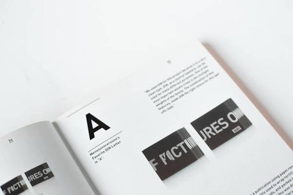
Typography is the art and technique of arranging type to make written language legible, readable and appealing when displayed.
<Box maxWidth="240px">
	<Card size="2">
		<Inset clip="padding-box" side="top" pb="current">
			<img
				src="https://images.unsplash.com/photo-1617050318658-a9a3175e34cb?ixlib=rb-4.0.3&ixid=M3wxMjA3fDB8MHxwaG90by1wYWdlfHx8fGVufDB8fHx8fA%3D%3D&auto=format&fit=crop&w=600&q=80"
				alt="Bold typography"
				style={{
					display: "block",
					objectFit: "cover",
					width: "100%",
					height: 140,
					backgroundColor: "var(--gray-5)",
				}}
			/>
		</Inset>
		<Text as="p" size="3">
			<Strong>Typography</Strong> is the art and technique of arranging type to
			make written language legible, readable and appealing when displayed.
		</Text>
	</Card>
</Box>